
GitHub social preview image generator
Without a social preview, a shared repository link shows your avatar and the repo name. Add your screenshots below and download a 1280 × 640 PNG that shows the app itself.
Start with your screenshots
Up to 4 screenshots, desktop or mobile: import them, or paste your website's address to capture it on desktop and mobile. Add your logo and pick the brand color, or let it come from your first screenshot.
Showcase
Text on the left, browser and phone
Click a template to start from it in the editor.
What GitHub expects
The social preview is the image that appears when someone pastes your repository URL into Slack, Discord, X, LinkedIn or an issue on another site. GitHub's own guidance is short, and worth knowing before you design anything:
| Rule | Value |
|---|---|
| Best display | 1280 × 640 px (a 2:1 ratio) |
| Minimum | 640 × 320 px |
| Weight | under 1 MB |
| Formats | PNG, JPG or GIF (transparent PNG accepted) |
Cover Studio's GitHub format is exactly 1280 × 640. For reference, the social preview of our own repository, made with this tool, weighs 628 KB: comfortably under the limit. Keep the default 1× export; the 2× option doubles the pixels and can push the file past 1 MB.
Examples made with Cover Studio
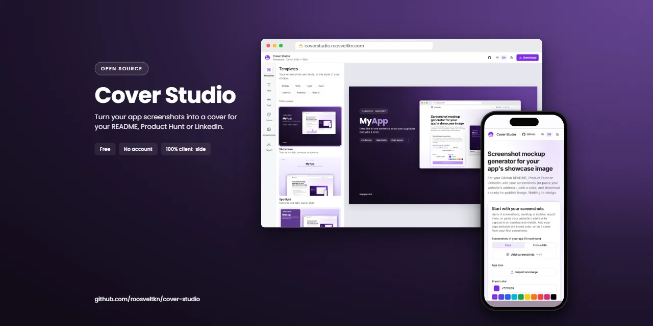
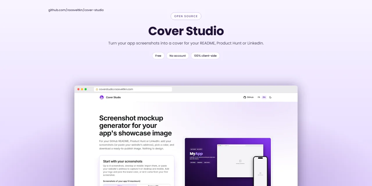
Upload it to your repository
- Open the repository on GitHub and go to Settings (the tab under the repository name).
- In the General section, find Social preview and click Edit.
- Choose Upload an image… and pick the PNG you downloaded here.
GitHub only shares the image from a public repository. Platforms cache link previews, so a link already posted somewhere may keep its old card for a while; a fresh share picks up the new one.
What makes a preview readable
The image is usually displayed around 500 px wide, sometimes less. What survives that size is a short name, one sentence at most, and a screenshot large enough to recognise the interface. A full paragraph or a dense dashboard turns into noise.
- Keep the text in the left or top area: some apps crop the edges of the card.
- Pick a brand colour with enough contrast against white text; Cover Studio derives the whole palette from it.
- Use your best screen, not your login page. If the app is mobile-first, a phone screenshot works just as well.
- Avoid transparency unless you have checked the image on both light and dark backgrounds.
The same image often ends up at the top of the README too. If you want a taller visual there, see the README banner page, which uses the larger 16:10 format.
Frequently asked questions
What size is a GitHub social preview?
1280 × 640 pixels for the best display, at least 640 × 320, and under 1 MB. That is a 2:1 ratio, which is the GitHub format in Cover Studio.
Why does my shared link still show the old image?
Slack, X, LinkedIn and others cache link previews. New shares usually show the new image; for an existing post, the platform decides when it refreshes.
Can I use the same image for Open Graph on my website?
You can, but the Open Graph format is 1200 × 630, a slightly different ratio. Cover Studio exports both from the same design: switch the format in the Export panel.
Are my screenshots uploaded anywhere?
No. The layout and the PNG export run in your browser; the screenshots never leave your device.