
GitHub README banner generator
Visitors decide in a few seconds whether a project is for them. A banner built from your real screenshots answers before they read a line. Add them below, download the PNG, paste two lines of Markdown.
Start with your screenshots
Up to 4 screenshots, desktop or mobile: import them, or paste your website's address to capture it on desktop and mobile. Add your logo and pick the brand color, or let it come from your first screenshot.
Showcase
Text on the left, browser and phone
Click a template to start from it in the editor.
A banner that shows the product
Most README headers are a logo on a gradient. That says nothing about what the software does. A banner with the actual interface, framed in a browser or a phone, does the job of the first paragraph and the first screenshot at once.
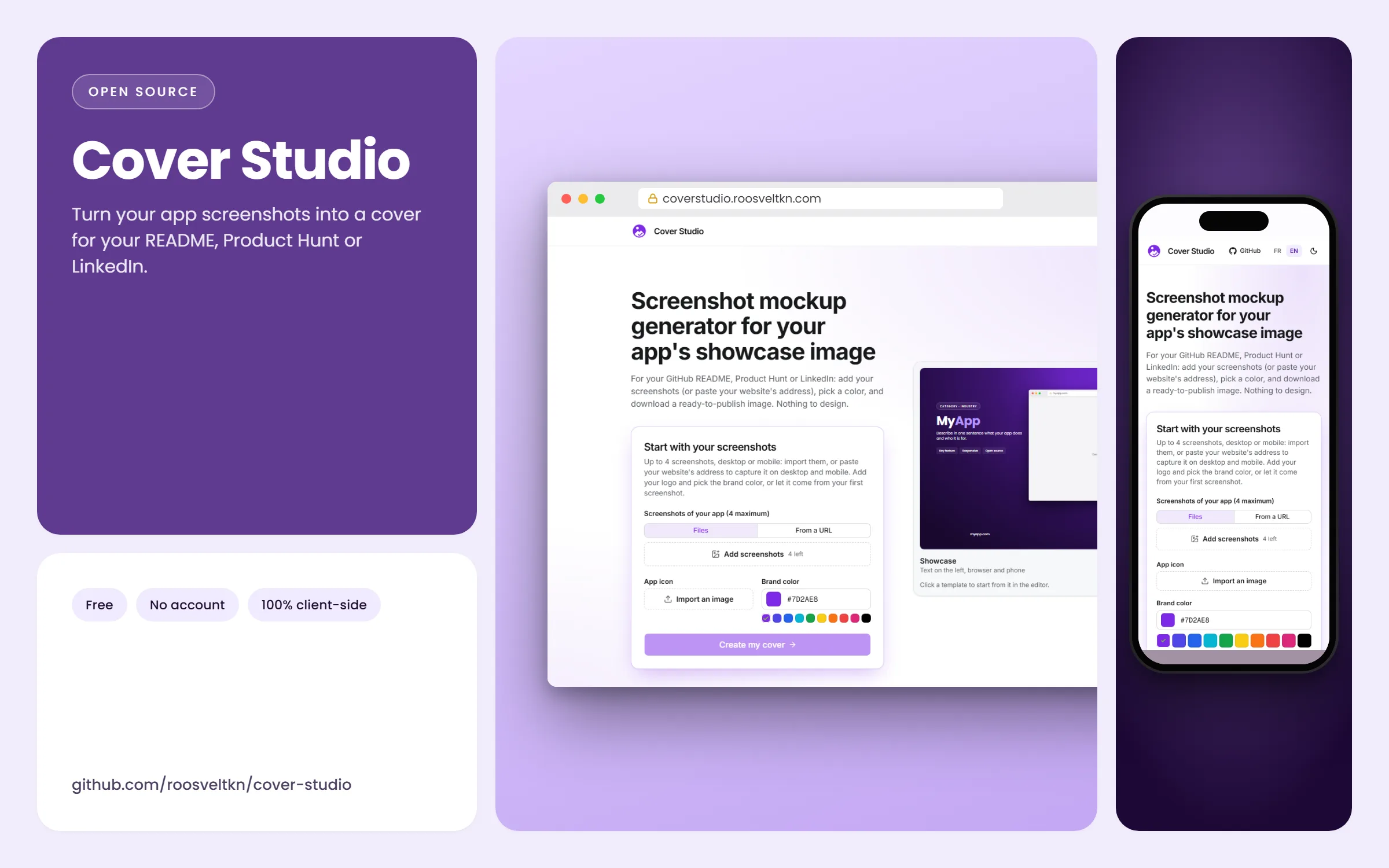
This page opens the editor in the Cover format, 2400 × 1500 (16:10). The README column on github.com is under 1,000 px wide, so the image stays sharp on high-density screens while GitHub scales it down.
Add it to your README
Commit the PNG to the repository (a docs/assets/ folder is a common choice) and reference it with a relative path, so the image follows forks and branches:
To control the width or centre it, GitHub also accepts plain HTML in a README:
<p align="center">
  <img src="docs/assets/cover.png" alt="My app: dashboard and mobile view" width="800">
</p>
GitHub supports the <picture> element too, so you can export a light and a dark version of the same banner and let the reader's theme pick one.
<picture>
  <source media="(prefers-color-scheme: dark)" srcset="docs/assets/cover-dark.png">
  <img src="docs/assets/cover.png" alt="My app: dashboard and mobile view">
</picture>
Banner or social preview?
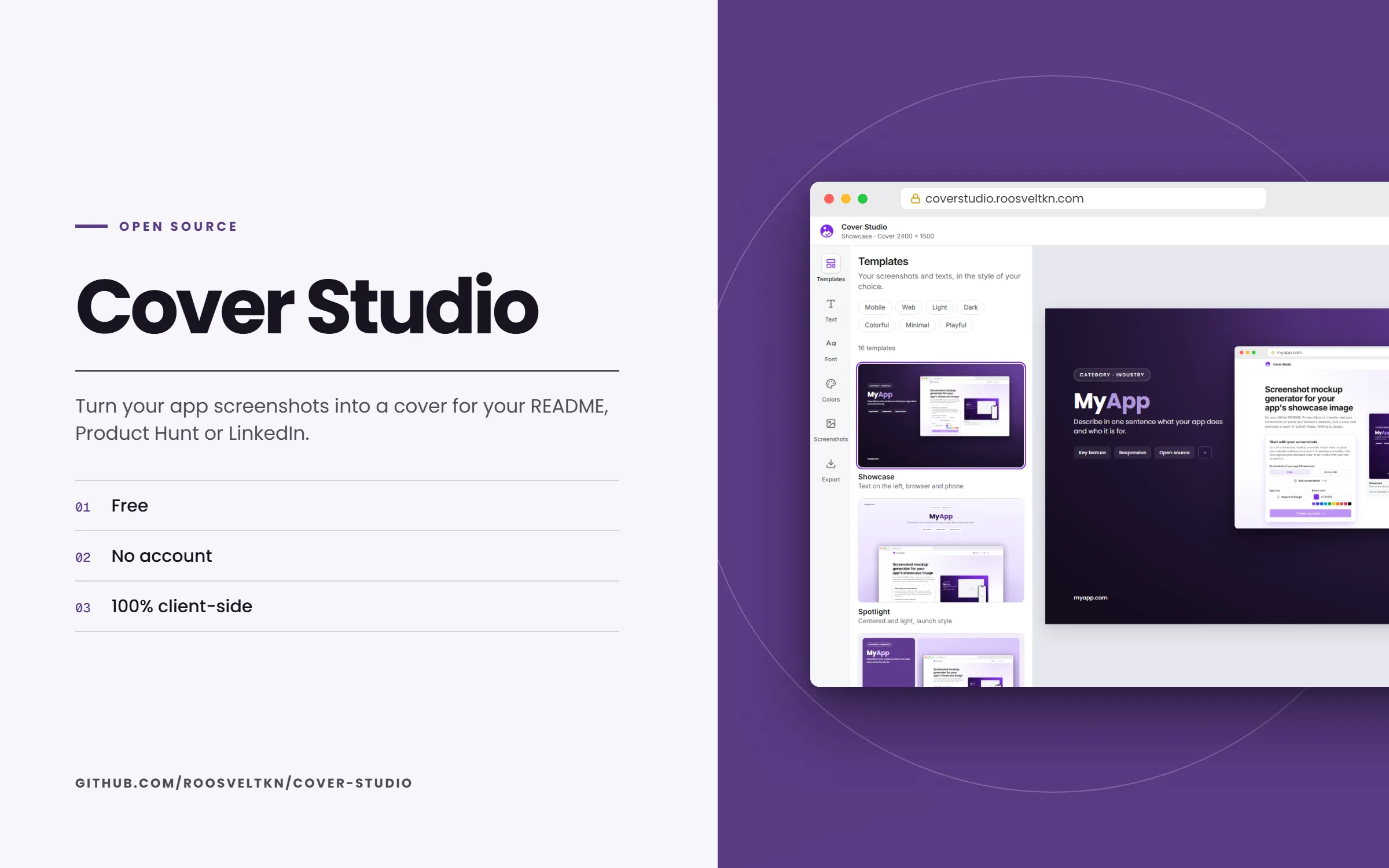
They are two different images. The README banner lives in the page; the GitHub social preview is the 1280 × 640 card shown when the repository link is shared elsewhere. Many projects use one design for both: build it here, then switch the format to GitHub in the Export panel and download it a second time.
Keep it honest and light
- Use current screenshots: a banner that no longer matches the app costs more trust than no banner.
- Write the alt text as a sentence about the product, not "banner".
- Re-export when the interface changes. Cover Studio keeps your texts and colours in the browser, so it takes a minute.
- If the repository is a library without a UI, a banner of a demo or of the docs site works better than an empty frame.
Frequently asked questions
What size should a GitHub README banner be?
There is no imposed size. A wide image of at least 1600 px stays sharp on high-density screens; Cover Studio exports 2400 × 1500. Keep the file light enough to load fast.
Is this a GitHub profile banner?
No. Profile READMEs usually want a decorative header about a person. This page is about a project: the banner shows the app from its screenshots.
Can I edit the banner later?
Yes. Your texts and colours are kept in your browser; import new screenshots and export again.
Do I need an account or a watermark-free plan?
No account, no watermark, no export limit: Cover Studio is free and open source (MIT).